Is your website working against the rest of your advertising? A poorly-conceived site can stop the traffic dead in its tracks.
Photo Credit: Free HDR & Photomanipulations – www.freestock.cavia Compfight cc
I met recently with a personal injury attorney in the south. His practice handles the usual PI stuff — car wrecks, product liability, medical malpractice, etc. But he has a special expertise in one particular area: oilfield injuries.
He graduated college with a degree in petroleum engineering, and spent several years working on the rigs before going into law. An oil worker injured on the job might be very interested in an attorney who knew the industry, and this guy knows it.
The attorney’s TV commercial does a great job telling the story. He appears in a workshirt and hard hat. There are powerful images of oil rigs, workers in baskets hanging from a crane, helicopters.
The commercial invites viewers to go to his website to find out more. And that’s where everything he’s gained with the TV ad begins to evaporate.
- Instead of oil rigs, there’s a picture of a generic courtroom.
- Instead of workers hanging in baskets, there’s a photo of a gavel.
- Instead of the story of a guy who worked on the rigs right out of college, there’s a generic “About Our Firm” page.
The TV ad was working — it drove people to the website — but that’s where the traffic stopped. Viewers wanted to hire the guy in the hardhat, but the guy in the hardhat was nowhere to be found. I’ve advised him to work with his web developer to make sure the message on the site matches the message on the TV ad.
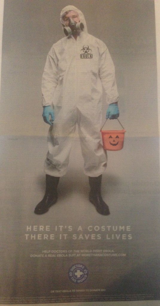
By contrast, Doctors of the World recently did a fabulous job of matching offline and online marketing. As I discussed in this space last week, the humanitarian organization tapped into the “Ebola Costume” craze by encouraging people to donate money to buy real Ebola gear for real doctors. The print ad looked like this:
Ad appearing in USA Today October 30, 2014
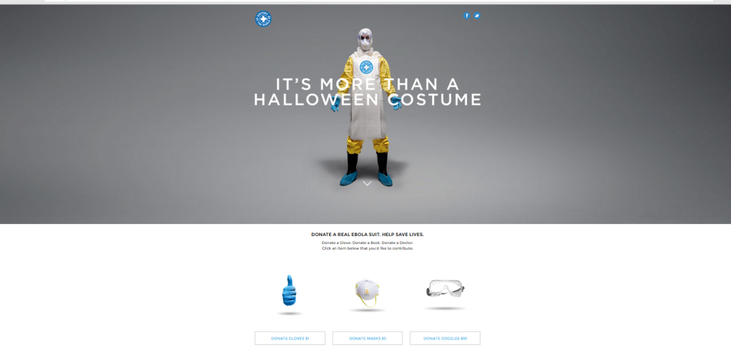
Readers were directed to an online direct-response landing page. You can see it below.
The photo on the site immediately notifies readers they’ve come to the right place. Below the photo is an easy way to take action — a simple set of “click to donate” buttons with amounts cleverly matched to specific pieces of equipment.
[reminder]What’s the best message-matching website you’ve encountered? What’s the worst?[/reminder]


